- Access exclusive content
- Connect with peers
- Share your expertise
- Find support resources
Click Preferences to customize your cookie settings.
Unlock your full community experience!
New Global Protect 3.0 is not good enough
- LIVEcommunity
- Discussions
- General Topics
- Re: New Global Protect 3.0 is not good enough
- Subscribe to RSS Feed
- Mark Topic as New
- Mark Topic as Read
- Float this Topic for Current User
- Printer Friendly Page
New Global Protect 3.0 is not good enough
- Mark as New
- Subscribe to RSS Feed
- Permalink
04-06-2016 01:51 PM - edited 04-06-2016 04:21 PM
I was looking forwad to the 'new and improved' Global Protect.
I am still very dissapointed at how it works from a UI standpoint.
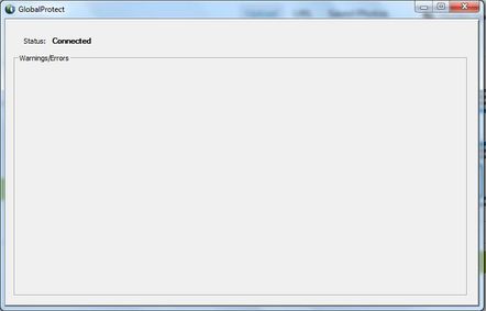
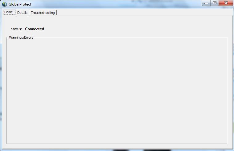
When I am connected to the VPN how do I disconnect? Is there a button hiding around in this awful GUI? The only way I know of is to go to the task bar and do it from there. Can anyone please let me know of another way?
Why Am I able to resize the GUI so it's smaller than the minimal size required? It's not a deal breaker but really just signs of shoddy programming.
The user's need 1 button - Connect.
Once the VPN is connected change the button to Disconnect.
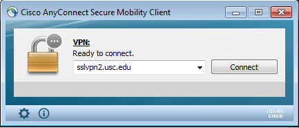
I wish you would hurry up and design it so it's something like Anyconnect:
Here's my post from last year wondering about the same problems, I was hoping that PA engineers were listening but I'm still waiting for a Global Protect application that's as equal quality to the rest of the PA platform.
- Mark as New
- Subscribe to RSS Feed
- Permalink
04-06-2016 03:56 PM - edited 04-06-2016 05:26 PM
While I'm still in rant mode here's a few other quirks that are frustrating.
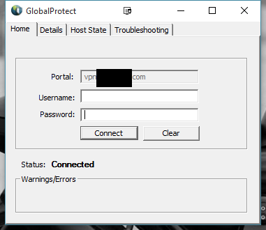
When a user is connected to the VPN the 'Connect' button should be greyed out as they are already connected:
People often get confused as most applications have a UI that conforms to this. People will see the connect button still clickable and keep trying to connect rather than looking at the status window below.
Ways to improve this:
- When the VPN is connected grey it out. Get rid of the 'Clear' button and change it to 'Disconnect.'
- A better solution is to change the 'Connect' button to 'Disconnect' when the VPN is active.
- Edit - And get rid of the clear button altogether. I don't think there's any need for it.
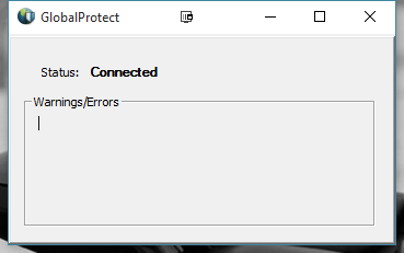
Another possible issue, I attempted to remove the 'Enable Advanced Mode' option in the PA's client config section and it just displays a blank panel. Anyone know what the use of this panel is for?
Edit - Anyone know how I tag/label this post with Globalprotect?
- Mark as New
- Subscribe to RSS Feed
- Permalink
04-06-2016 04:19 PM
I wholeheartedly agree with this. I have brought it up with multiple people at ignite this year and previously with product managers.
The programming you refer to is a few minutes in visual studio for the UI, but can be cosmetically improved 1000 fold. I understand they were going for function, but we are in a world where the user experience matters. If the user experience is not great, they won't accept and use the product.
They made a change so that they can provide updates to GlobalProtect without having to wait for OS updates, which is great and needed for the development of the product, so hopefully they will utilize that and we see improvements via that route.
- Mark as New
- Subscribe to RSS Feed
- Permalink
04-06-2016 04:41 PM
Hi,
I opened a case about the Connect button that doesn't turn into a disconnect button when connected. Product management refused to acknowledge it was a shortcoming and instead said it was a design decision that it works like that. I will make a feature request to my SE to add a Disconnect button in the panel.
Benjamin
- Mark as New
- Subscribe to RSS Feed
- Permalink
04-06-2016 05:19 PM
Glad to see I'm not the only one with these frustrations. I'll try and raise a feature request as well.
- Mark as New
- Subscribe to RSS Feed
- Permalink
04-06-2016 06:00 PM
- Mark as New
- Subscribe to RSS Feed
- Permalink
04-06-2016 06:52 PM
Question for you guys...Other than the UI / asthetics are there any detractors over AnyConnect?
My company has around 3,000 remote users at peak, but typically around 1,500. A great feature around the ASA is a function called CWS. Essentially it allows us to cloud enable web content filtering. With CWS we can allow clients to go "direct out" to the Internet w/o having to force all remote clients back to a corporate HQ get processed and then sent back out to the Internet.
Unfortunately CWS only works for HTTP(S) traffic.
With GP can we leverage PAN-DB and have users get filtered in the cloud as well?
- Mark as New
- Subscribe to RSS Feed
- Permalink
04-06-2016 07:27 PM
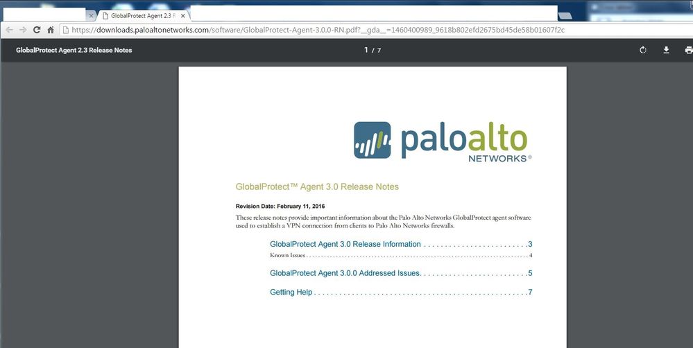
I think someone missed something we they put together the release notes doc for GP 3.0 (2.3?)
- Mark as New
- Subscribe to RSS Feed
- Permalink
04-06-2016 08:04 PM
Only way I can see you doing that is if you deploy their PAN FW VM on AWS or Azure, get URL Filtering and have your Gateway be that VM, instead of back home in HQ.
Their whole idea around GlobalProtect and I have to agree, is leveraging the features of the PAN firewall like the threat prevention suite, but you can certainly do that in a VM out in the cloud.
It is not just the UI, that is just one thing in a list of things that can be improved.
another issue is the upgrading process or lack of allowing us to do inplace upgrades so we can deploy using other deployment methods like SystemCenter. The upgrade process has left users stranded without GlobalProtect installed since the 2nd phase never completed.
Another is performance related. GP IPSEC gets to about the same speeds as SSL VPN with anyconnect, which should not be happening. If I run SSLVPN on GP, its horribly slower. Definitely would like to see it improved/optimized, I should be able to push a decent amount of traffic when you have the bandwidth on both ends of the connection.
I don't want to take away from the sole purpose of this thread, which is the cosmetic/UI.
- Mark as New
- Subscribe to RSS Feed
- Permalink
04-06-2016 08:07 PM
Better release notes here:
https://www.paloaltonetworks.com/documentation/30/globalprotect-agent-rns
Other features are tied to PAN OS 7.1 - https://www.paloaltonetworks.com/documentation/71/globalprotect
- Mark as New
- Subscribe to RSS Feed
- Permalink
04-06-2016 11:17 PM
PS: The intent of this response is not to engage in a conversation of whether the app UI can be improved or not , nor the product roadmap will be discussed in this forum. For product roadmap discussion please engage with your account team to schedule one.
To have constructive discussion curious to understand the issues discussed in this thread. In an Always On mode user does not interact with the application to connect or disconnect because it happens automatically for the user. The issues raised here for on-demand mode i.e. a pure remote access use case.
Lets go through the user workflow , user want to connect to VPN , user locates the GlobalProtect icon from system try and right clicks , the menu options appear with list of options , since the primary action of the user is to connect , the user chooses the connect option , the app will prompt the user to enter credentials and the user gets connected. Now the user does the work that needs to be done. Now the user wants to disconnect from the VPN , the user locates the GlobalProtect icon from system try and right clicks , the menu options appear with list of options , since the primary action of the user is to disconnect , the user chooses the disconnect option and VPN is disonnected. No reason for the user to open up the app to the home screen in the primary workflow.
Now lets gp through the workflow when the user do open the app to the home screen.
user want to connect to VPN , user locates the GlobalProtect icon from system try and right clicks , the menu options appear with list of options , the primary action of the user is to connect , the user instead of choosing the connect option (1 click to connect), say the user chooses to open the app , the app opens to the home screen , the user enter credentials and the user gets connected, user closes the GlobalProtect app , the user does the work that needs to be done, Now the user wants to disconnect from the VPN , the user locates the GlobalProtect icon from system try and right clicks , the menu options appear with list of options , since the primary action of the user is to disconnect , the user chooses the disconnect option and VPN is disonnected. No reason for the user to open up the app to the home screen in this workflow either.
Will the user try to disonnect from the home panel only during lab/poc/testing , as oppose to day to day regualr user ?
- Mark as New
- Subscribe to RSS Feed
- Permalink
04-07-2016 05:38 AM
Excellent points and I agree the UI comes into play more with an on-demand scenario.
In an Always On mode, the user interface comes into play during troubleshooting (or they simply want to see the status), when the user wants to have some control over it, or to like speed it up.
In an always on setup, I agree that they should not have to open the client much, but the gateway authentication process prompts them for their username and password on first connection (if not already placed into the client UI), but other times SSO works as it should. They also go into the client UI to update such password every time their password changes (depending on policy and requirements of various businesses). Other VPN Clients do not ask for username/password, is SSO and seamless. Ultimately this would be the most ideal as credentials are not stored.
It sounds like you are gearing towards having the main processes accessible via the GP submenu from the taskbar (to avoid opening up the main UI). This is fine and most folks can do that as well. Disable is there for those that need to "disconnect" from Always on for whatever reason. All it takes is double clicking the GP icon and the UI home is open or misclicking on Show panel, and the UI is shown.
Why are you limiting the "Status" button of the 3.x client? Having it be whatever size, as previously mentioned by others, does not make sense for some of these screens such as the "status page". It is a lot of deadspace. I rather instruct my users to go to show panel (or simply doubleclick the GP icon) because it gives them access to more data that they need, such as how they are connected, IP addresses. etc or troubleshooting. I get that you are keeping it resizable/large for essentially the details and troubleshooting tabs.
Menu
Status
Show Panel (shows status as well)
In the end, the user is going to open the panel at some point or two and perception is key. Especially to acceptance of the product.
- Mark as New
- Subscribe to RSS Feed
- Permalink
04-07-2016 10:13 AM
Jmenon,
Yes I'm strictly talking about the on-demand VPN. We have a 2-factor on-demand setup and don't allow the always on VPN in our network.
From your post:
Lets go through the user workflow , user want to connect to VPN , user locates the GlobalProtect icon from system try and right clicks
I have a problem with this very first step. When I ask an end user on a Windows computer to open an application they do the following:
- Search for a shortcut on the desktop
- Search the task bar
- Search the start menu
- Perform a search
It doesn't always happen in this order but none (of my users at least) ever go to the system tray to open an application. Our end users also have many icons in their system tray that they don't know or care about. It's frustrating to try an explain to them to 'find the circle Earth shaped icon and right click.' The system tray icons are now hidden by default in the later versions of Windows so it's bad enough trying to get them to 'click on the arrow in the taskbar to expand the system tray.'
It's just not how the layperson works.
Do you see how frustrating this is when other (Anyconnect) VPN solutions are much cleaner and simpler?
Also, yes, our users will try to open the application to disconnect in day to day regular use.
@jmenon wrote:
PS: The intent of this response is not to engage in a conversation of whether the app UI can be improved or not , nor the product roadmap will be discussed in this forum. For product roadmap discussion please engage with your account team to schedule one.
To have constructive discussion curious to understand the issues discussed in this thread. In an Always On mode user does not interact with the application to connect or disconnect because it happens automatically for the user. The issues raised here for on-demand mode i.e. a pure remote access use case.
Lets go through the user workflow , user want to connect to VPN , user locates the GlobalProtect icon from system try and right clicks , the menu options appear with list of options , since the primary action of the user is to connect , the user chooses the connect option , the app will prompt the user to enter credentials and the user gets connected. Now the user does the work that needs to be done. Now the user wants to disconnect from the VPN , the user locates the GlobalProtect icon from system try and right clicks , the menu options appear with list of options , since the primary action of the user is to disconnect , the user chooses the disconnect option and VPN is disonnected. No reason for the user to open up the app to the home screen in the primary workflow.
Now lets gp through the workflow when the user do open the app to the home screen.
user want to connect to VPN , user locates the GlobalProtect icon from system try and right clicks , the menu options appear with list of options , the primary action of the user is to connect , the user instead of choosing the connect option (1 click to connect), say the user chooses to open the app , the app opens to the home screen , the user enter credentials and the user gets connected, user closes the GlobalProtect app , the user does the work that needs to be done, Now the user wants to disconnect from the VPN , the user locates the GlobalProtect icon from system try and right clicks , the menu options appear with list of options , since the primary action of the user is to disconnect , the user chooses the disconnect option and VPN is disonnected. No reason for the user to open up the app to the home screen in this workflow either.
Will the user try to disonnect from the home panel only during lab/poc/testing , as oppose to day to day regualr user ?
- Mark as New
- Subscribe to RSS Feed
- Permalink
04-08-2016 08:41 PM - edited 05-02-2016 04:00 PM
Good points.
- Mark as New
- Subscribe to RSS Feed
- Permalink
04-08-2016 08:47 PM
@rbista wrote:
You didn't make any points.
Are you replying to me? I'm not sure. I think I've been pretty clear but let me know if there's any points I can be clearer on.
- 32795 Views
- 41 replies
- 14 Likes
Show your appreciation!
Click Accept as Solution to acknowledge that the answer to your question has been provided.
The button appears next to the replies on topics you’ve started. The member who gave the solution and all future visitors to this topic will appreciate it!
These simple actions take just seconds of your time, but go a long way in showing appreciation for community members and the LIVEcommunity as a whole!
The LIVEcommunity thanks you for your participation!
- MacOS uninstall password reset in Cortex XDR Discussions
- Es posible bloquear una IP en cortex xdr pro in Cortex XDR Discussions
- PAN‑OS versions affected by PAN‑307795 in Next-Generation Firewall Discussions
- Updating Cortex Agent by MDM in Cortex XDR Discussions
- I'd like to download global protect 6.2.6-838 in General Topics


